About FreshCheck

FreshCheck is a student-led innovation focused on reducing food waste by making food freshness visible. Our solution replaces unreliable expiration dates with a simple, color-changing sensor that shows the real freshness of food in real time.

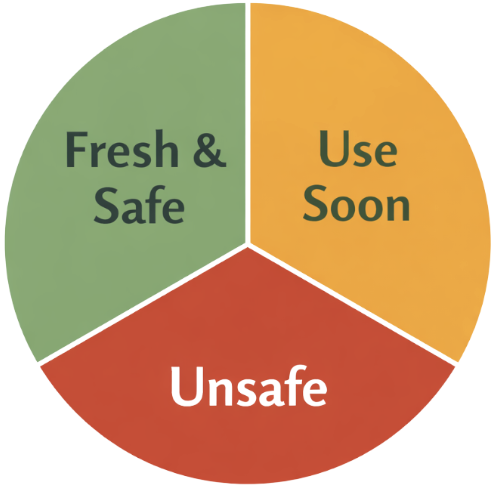
The FreshCheck logo is inspired by the product itself: a circular sensor. It uses a three-color system – green, yellow, and red – to clearly represent fresh, use-soon, and spoiled food. A simple food symbol at the center represents food safety and sustainability. The logo is designed to be clean, recognizable, and effective at small sizes.

Color Scheme

FreshCheck uses an intuitive color system that mirrors universal warning signals which can be seen in the pie-chart on the right. Neutral black and off-white tones are used for text and backgrounds to maintain clarity and readability.

Brand Voice & Tone

FreshCheck’s brand voice is clear, confident, and science-based. Our tone is simple and accessible, avoiding unnecessary technical jargon while remaining accurate and informative. We communicate in a way that is easy to understand for all audiences, whether scientific or non-scientific, ensuring our ideas are approachable and trustworthy.

Design Style

Our design style is minimalist and functional, with clean layouts, ample white space, simple diagrams, and food imagery. Rounded shapes, clear visuals, and consistent typography convey safety, trust, and approachability, reflecting FreshCheck’s scientific reliability and helping users quickly understand and engage.
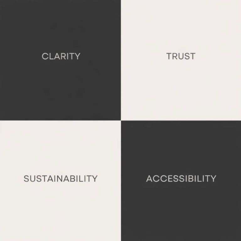
Brand Values